The complex simplicity of my static websites
A deep dive into using indentation-based languages to build websites
August 8, 2023
It was the spring of 2014, over 9 years ago, just 6 months into my first year of college, when my Computer Architecture teacher stopped in the middle of an assembly exercise to tell us that Bitdefender is hiring juniors for Malware Researcher positions.
I had no idea what that is, but boy, did it sound cool?…
I fondly remember how at that time we weren’t chasing high salaries and filtering jobs by programming languages and frameworks. We just wanted to learn something.
As students, we needed money as well of course, but when I got the job for
1750 lei(~€350), I suddenly became the richest 18 year old in my home town, so it wasn’t the top priority.
And we learnt so much in 2 years.. obscure things like AOP, a lot of x86 assembly, reverse engineering techniques which dumped us head first into languages like Java, .NET, ActionScript? (malware authors were creative).
But most of all, we did tons of Python scripting, and we loved every minute of it. It was my first time getting acquainted with fast tools like Sublime Text and FAR Manager. Coming from Notepad++ and Windows Explorer, I felt like a mad hacker with the world at my fingertips.
I’m known as a macOS app dev nowadays, but 9 years ago, I actually started by writing petty Python scripts which spurred the obsessive love I have nowadays for clean accolade-free code and indentation based languages.
What does all that have to do with static websites though?
# Pythonic HTML
Well, 5 years ago, when I launched my first macOS app, I found myself needing to create a simple webpage to showcase the app and at the very least, provide a way to download it.
And HTML I did not want to write. The XML like syntax is something I always dreaded, so overfilled with unnecessary </> symbols that make both writing and reading much more cumbersome. I wanted Python syntax for HTML so I went looking for it.
I went through pug…
|
|
pretty, but still needs () for attributes, and I still need accolades in CSS and JS
then haml…
|
|
even more symbols: %, :, => and / for self-closing tags
…and eventually stumbled upon Slim and its Python counterpart: Plim
|
|
ahhh.. so clean!
Here’s how that example looks like if I would have to write it as HTML:
|
|
not particulary hard to read, but writing would need a lot of Shift-holding and repeating tags
The thing I like most about Plim, and why I stuck with it, is that it can parse my other favorite symbol-hating languages without additional configuration:
- Python for abstracting away repeating structures
- Stylus for writing
styletags - CoffeeScript for the
scripttags - Markdown for long text content
Here’s a more complex example to showcase the above features (might require sunglasses):
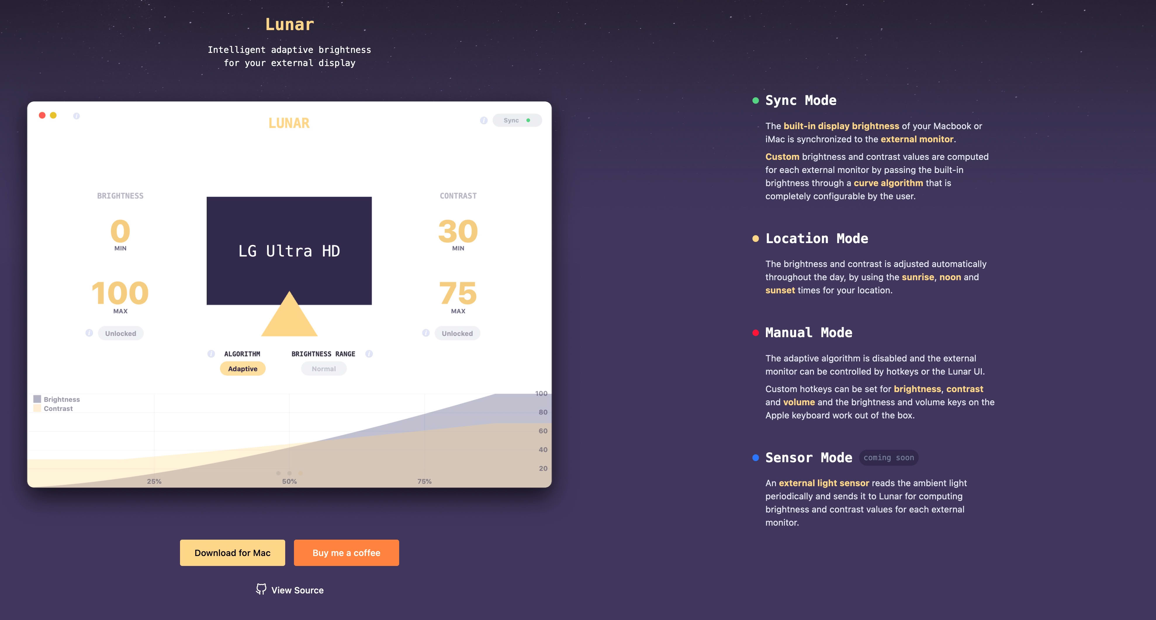
example of writing a HDR page section, similar to the one on lunar.fyi
|
|
And best of all, there is no crazy toolchain, bundler or dependency hell involved. No project structure needed, no configuration files. I can just write a contact.plim file, compile it with plimc to a readable contact.html and have a /contact page ready!
So that’s how it went with my app: I wrote a simple index.plim, dropped it on Netlify and went on with my day.
# Complexity Cost
- 1 pip install for getting the Plim CLI
- 1 npm install for getting
stylusandcoffeescript(optional) - 1 build command for generating the HTML files
# Complex simplicity
The app managed to get quite a bit of attention, and while I kept developing it, for the next 4 years the website remained the same heading - image - download button single page. It was only a side project after all.
Working for US companies from Romania made good money, but it was so tiring to get through 3h of video meetings daily, standups, syntax nitpicking in PR review, SCRUM bullshit, JIRA, task writing, task assigning, estimating task time in T-shirt sizes??
In April 2021 I finally got tired of writing useless code and selling my time like it was some grain silo I could always fill back up with even more work…
I bet on developing my app further. Since my college days, I always chose the work that helps me learn new concepts. At some point I had to understand that I learnt enough and had to start sharing. This time I really wanted to write software that helped people, and was willing to spend my savings on it.
# Comically Stuffed Stylesheets
A more complete app also required a more complete presentation website, but the styling was getting out of hand. You would think that with flexbox and grids, you can just write vanilla CSS these days, but just adding a bit of variation requires constant jumping between the CSS and HTML files.
A presentation page is usually only 10% HTML markup. The rest is a ton of styling and copy text, so I wanted to optimize my dev experience for that.
There’s no “go to definition” on HTML .classes or #ids because their styles can be defined ✨anywhere✨. So you have to Cmd-F like a madman and be very rigorous on your CSS structure.
The controversial but very clever solution to this was Tailwind CSS: a large collection of short predefined classes that mostly style just the property they hint at.
For example in the first code block I had to write a non-reusable 5-line style to center the body contents.
|
|
With Tailwind, I would have written the body tag like so:
|
|
That might not seem like much, some would argue that it’s even a lot less readable than the CSS one. Can’t I just define a .center class that I can reuse?
Well, think about a few things:
- this might repeat on many sections of the page, but with slight variations (what if I want a centered row, or longer paragraphs of text aligned to the left)
- responsive sections might need to alter layout (e.g. vertical on mobile, horizontal on desktop) and media queries will quickly blow up the style size
.md:flex-row.flex-colis what you would write in Tailwind
- adding dark/light mode support is yet another media query
.dark:bg-white.bg-blacklooks simple enough
- interactions like hover effects, complex shadows and filters like blur and brightness is syntax that’s often forgotten
.shadow.hover:shadow-xlcreates a lift off the page effect on hover by making the shadow larger.blur.active:blur-noneun-blurs an element when you click on it
- choosing colors and reusing them needs a lot of attention
.bg-red-500.text-whitesets white text on saturated redred-100is less saturated, towards whitered-900is darker, towards black
Sure, long lines of classes might not be so readable, but neither are long files of CSS styling. At least the Tailwind classes are right there at your fingertips, and you can replace a -lg with a -xl to quickly fine tune your style.
# Complexity Cost:
- 1 command added for building the minimal CSS from the classes used
- 1 npm install for getting the Tailwind CLI
- 1 config file for defining custom colors, animations etc. (optional)
# Responsive images
So many people obsess over the size of their JS or CSS, but fail to realize that the bulk of their page is unnecessarily large and not well compressed images.
Of course, I was one of those people.
For years, my app’s website had a screenshot of its window as an uncompressed PNG, loading slowly from top to bottom and chugging the user’s bandwidth.
I had no idea, but screenshots and screen recordings are most of the time up to 10x larger than their visually indistinguishable compressed counterparts.
I even wrote an app to fix that since I’m constantly sending screenshots to people and was tired of waiting for 5MB images to upload in rapid chats.
It’s called Clop if you want to check it out.
Yes, just like that famous ransomware, it wasn’t that famous at the time of naming the app.
I needed a lot more images to showcase the features of an app controlling monitor brightness and colors, so I had to improve on this.
Delivering the smallest image necessary to the user is quite a complex endeavour:
- Optimize the image using ImageOptim
- Resize it to fit multiple screen sizes using vipsthumbnail
- Figure out what fraction of the page width will be occupied by the image
- Write a suitable srcset attribute to load the suitable image
- Optional: convert the image to formats like
webp,avifor JPEG XL for smallest file size
I did so much of that work manually in the past… thankfully nowadays I have imgproxy to do the encoding, optimization and resizing for me.
I just have to write the srcset, for which I defined Plim and Python functions to do the string wrangling for me.
|
|
|
|
# Complexity Cost
- 1 imgproxy server that needs to run somewhere publicly available, be kept alive and secure
- some Python and Plim code for generating srcsets
# Hot reloading
After 2 weeks of editing the page, Cmd-Tab to the browser, Cmd-R to refresh, I got really tired of this routine.
I worked with Next.js before on Noiseblend and loved how each file change automatically gets refreshed in the browser. Instantly and in-place as well, not a full page refresh. I got the same experience when I worked with React Native.
There should be something for static pages too, I thought. Well it turns out there is, it’s called LiveReload and I had to slap my forehead for not searching for it sooner.
After installing the browser extension, and running the livereloadx --static file watcher, I got my hot reloading dev experience back.
Actually now that I think about it, Hugo has super fast hot reloading, how does it accomplish that? Yep, turns out Hugo uses LiveReload as well.
# Complexity Cost
- 1 more command to run in 1 more terminal panel, multiplex helps with that
- 1 browser extension to install and hope it’s not compromised or sold to a data thief
- 1 npm install for getting the livereloadx CLI
# Contact pages
After releasing the new app version, many things were broken, expectedly.
People tried to reach me in so many ways: Github issues, personal email, through the app licensing provider, even Facebook Messenger. I had no idea that including an official way of contact would be so vital.
And I had no idea how to even do it. A contact form needs, like, a server to POST to, right? And that server needs to notify me in some way, and then I have to respond to the user in some other way… sigh
I thought about those chat bubbles that a lot of sites have, but I used them on Noiseblend and did not like the experience. Plus I dislike seeing them myself, they’re an eyesore and a nuisance obscuring page content and possibly violating privacy.
After long searches, not sure why it took so long, I stumbled upon Formspark: a service that gives you a link to POST your form to, and they send you an email with the form contents. The email will contain the user email in ReplyTo so I can just reply normally from my mail client.
|
|
# Complexity Cost
None, I guess. I just hope that the prolific but unique Formspark dev doesn’t die or get kidnapped or something.
# And you call this “simple”?
It’s not. Really. It’s crazy what I had to go through to get to a productive setup that fits my needs.
One could say I could have spent all that time on writing vanilla HTML, CSS and JS and I would have had the same result in the same amount of time. I agree, if time would be all that mattered.
But for some people (like me), feeling productive, seeing how easy it is to test my ideas and how code seems to flow from my fingertips at the speed of thought, is what decides if I’ll ever finish and publish something, or if I’ll lose my patience and fallback to comfort zones.
Having to write the same boilerplate code over and over again, constant context switching between files, jumping back into a project after a few days and not knowing where everything was in those thousand-lines files.. these are all detractors that will eventually make me say ”f••k this! at least my day job brings money”.
# Reusability
So many JS frameworks were created in the name of reusable components, but they all failed for me.
I mean sure, I can “npm install” a React calendar, and I am now “reusing” and not “reimplementing” the hard work of someone better than me at calendar UIs. But just try to stray away a little from the happy path that the component creator envisioned, and you will find it is mind-bendingly hard to bend the component to your specific needs.
You might raise a Github issue and the creator will add a few params so you can customize that specific thing, but so will others with different and maybe clashing needs. Soon enough, that component is declared unwieldy and too complex to use, the dev will say “f••k this! I’d rather do furniture” and someone else will come out and say: here’s the next best thing in React calendar libraries, so much simpler to use than those behemoths!
I never had this goal in mind but unexpectedly, the above setup is generic enough that I was able to extract it into a set of files for starting a new website. I can now duplicate that folder and start changing site-specific bits to get a new website.
Here are the websites I’ve done using this method:
- lowtechguys.com / where I publish my apps
- subsol.one / app I made for my brother to publish parties on
- robert.panaitiu.com / my brother’s personal website
- lunar.fyi / the app I have been talking about above
And the best thing I remember is that for each website I published a working version, good looking enough, with a contact page and small bandwidth requirements, in less than a day.
How does this solve the problem of straying away from the happy path? Well, this is not an immutable library residing in node_modules, or a JS script on a CDN. It is a set of files I can modify to the site’s needs.
There is no high wall to jump (having to fork a library, figuring out its unique build system etc.) or need to stick to a specific structure. Once the folder is duplicated, it has its own life.
For those interested, here is the repo containing the current state of my templates: github.com/alin23/plim-website
I don’t recommend using it, it’s possible that I’m the only one who finds it simple because I know what went into it. But if you do, I’d love to hear your thoughts.
# Gatsby? Jekyll? Hugo?
Weirdly, this website I’m writing on is not made with Plim. At some point I decided to start a personal website, and I thought it probably needs a blog-aware site builder.
At the time, I didn’t know that RSS is an easily templatable XML file, and that all I need for a blog is to write Markdown.
I remember trying Gatsby and not liking the JS ecosystem around it. Jekyll was my second choice with Github Pages, but I think I fumbled too much with ruby and bundle to get it working and lost patience.
Both problems stemmed from my lack of familiarity with their ecosystems, but my goal was to write a blog, not learn Ruby and JS.
Hugo seemed much simpler, and it was also written in Go and distributed as a standalone binary, which I always like for my tools.
I marveled at Hugo’s speed, loved the fact that it supports theming (although it’s not as simple as it sounds) and that it has a lot of useful stuff built-in like syntax highlighting, image processing, RSS generator etc. But it took me sooo long to understand its structure.
There are many foreign words (to me) in Hugo: archetypes, taxonomies, shortcodes, partials, layouts, categories, series. Unfortunately, by the time I realized that I don’t need the flexibility that this structure provides, I had already finished this website and written my first article.
I also used a theme that uses the Tachyons CSS framework, for which I can never remember the right class to use. I thought about rewriting the website in Plim but converting everything to Tailwind or simple CSS would have been a lot of work.
I eventually started writing simple Markdown files for my notes, and have Caddy convert and serve them on the fly. Helps me write from my phone and not have to deal with Git and Hugo.
I still keep this for longform content, where a laptop is usually needed anyway.